Tag: Design
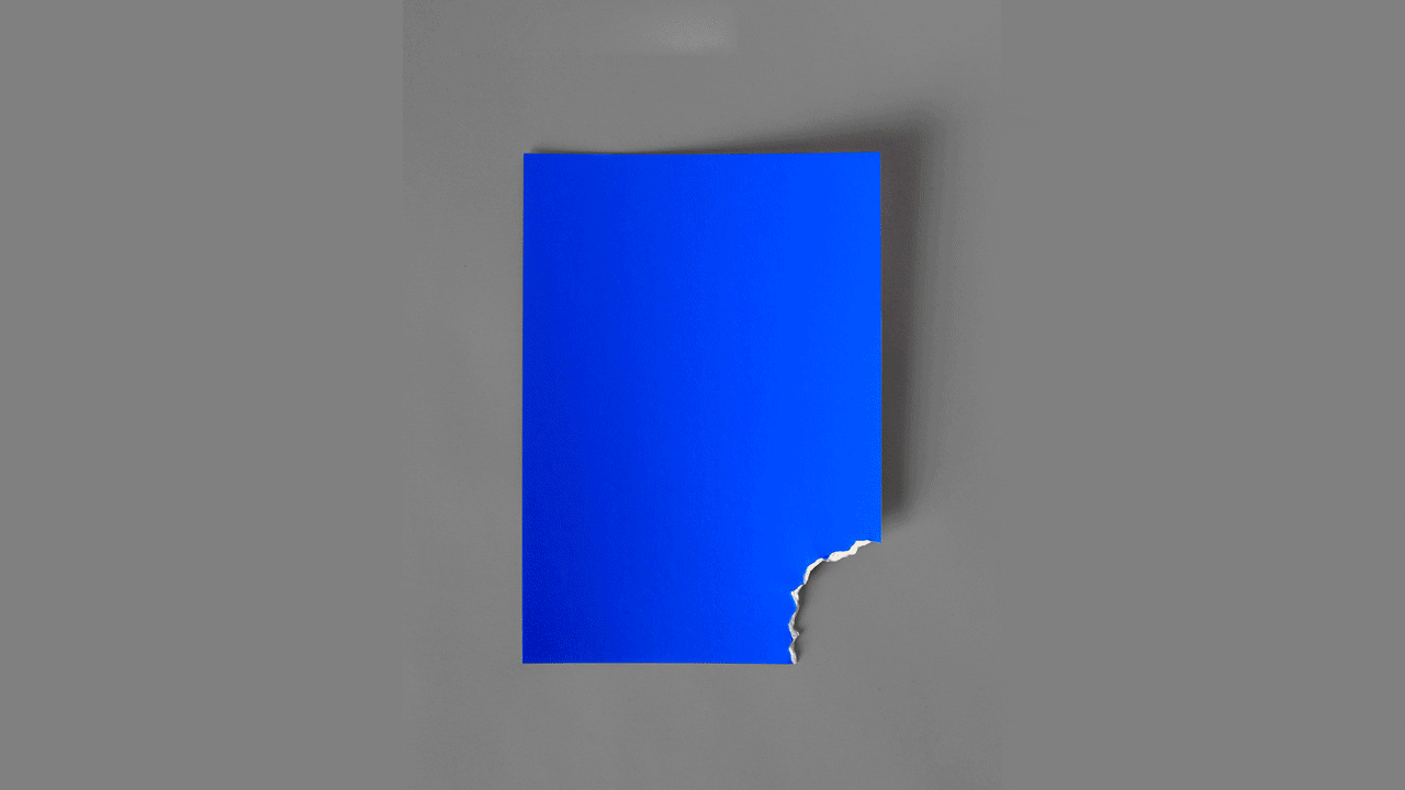
Here’s a series of film posters so minimalist, they’re essentially one or two sheets of slightly, ever-so-deliberately damaged paper (with deliberate shades/textures/fancy names, as listed in the gallery above). Jaws looks like a perfect ocean blue “bit” by the tiniest of sharks, The Curious Case of Benjamin Button is a crumpled (“wrinkled”) white sheet that gets […]
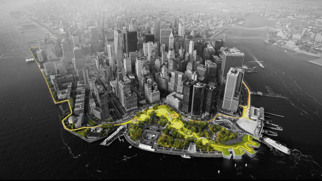
Now that the White House is firmly pointing at human-made climate change, we’re starting to face the reality that we’re totally screwed, coastal cities and other water-bound places in particular. The federal government is planning to allocate billions to save New York from the rising sea levels and disastrous new hurricanes, but how? The Verge has published […]
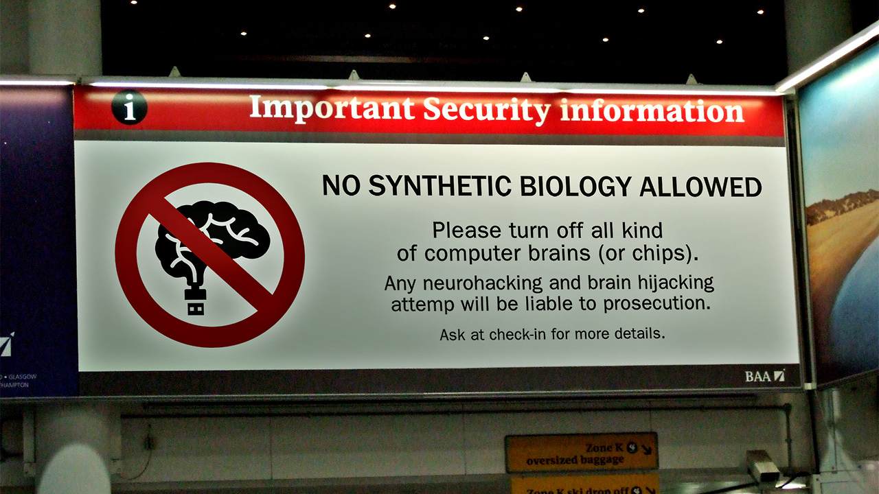
While driverless car lanes and drone zones aren’t exactly far fetched concepts, some of these Sings From the Near Future designed by Fernando Barbella are quite imaginative. Hahaha, hyperloop warnings on the subway? (Oh, wait, that could be legit.) 3D-printed meat? (Oh, wait. That’s real-ish too.) And while the “no synthetic biology allowed” signs in adorably butchered English […]
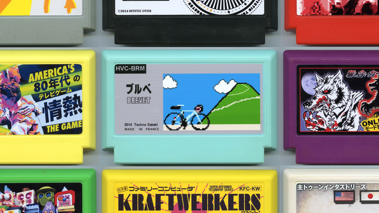
Every year, My Famicase Exhibition asks artist and designers to imagine Nintendo Entertainment System games that never were, then create the cartridge art for those games. This year’s entries are absolutely gorgeous, and many sound like games you’d actually want to play. In Children, by Cory Schmitz, kids of the future run amok because their parents are addicted to […]

Massimo Vignelli is very sick. The legendary graphic designer — his works include the 1970s-era NYC subway map and branding for companies like American Airlines and Bloomingdales — is “spending his last days at home,” according to Creative Review, and his son Luca is asking fans of Massimo’s work to send him letters. Says Michael Bierut of the design […]
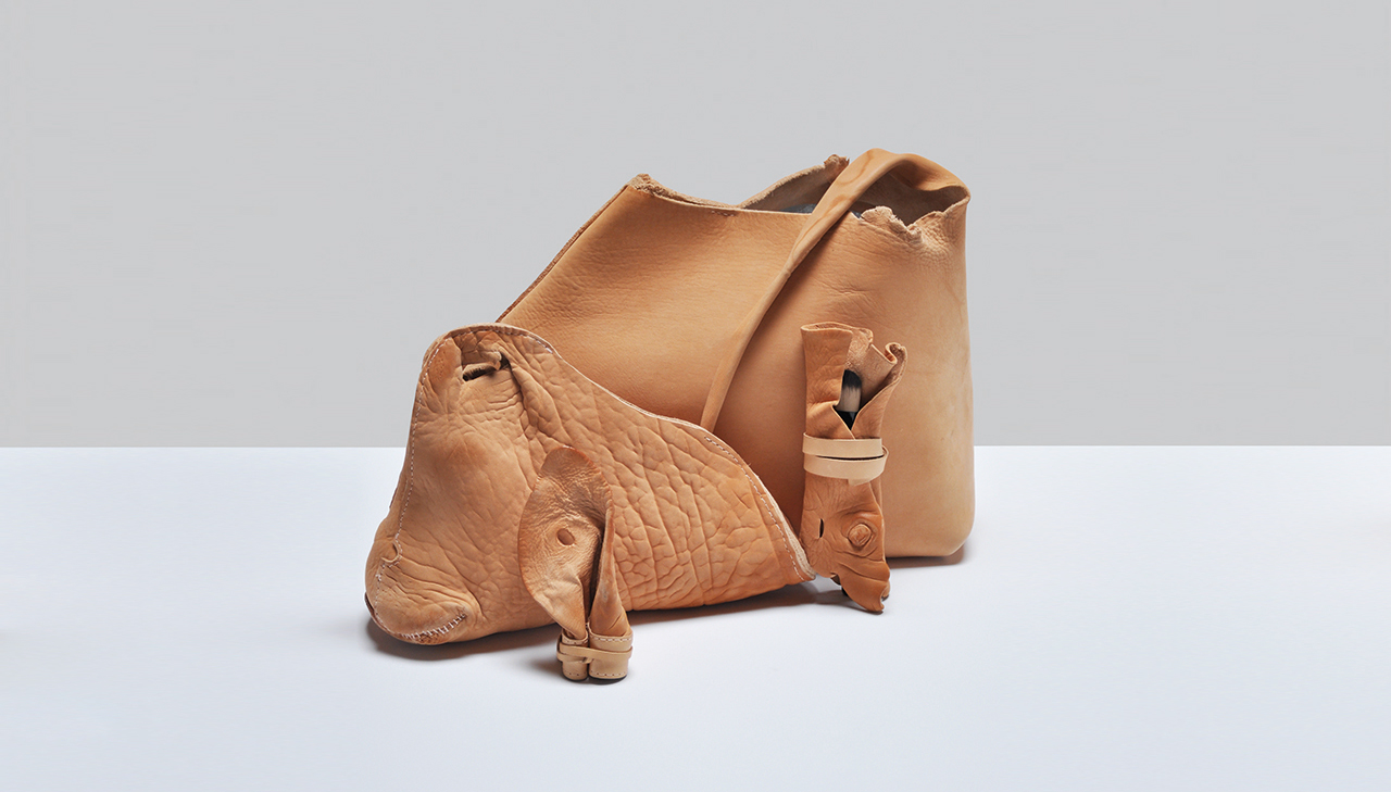
“Leather is dead animal skin,” says designer Victoria Ledig. Her big purse, clutch and make-up bag are made from leather and you can really, really tell. One looks just like cow skin peeled of a cow’s face. Another is a cow ear pouch, thick and pink. Another is a snout, it’s nose holes incorporated into the […]
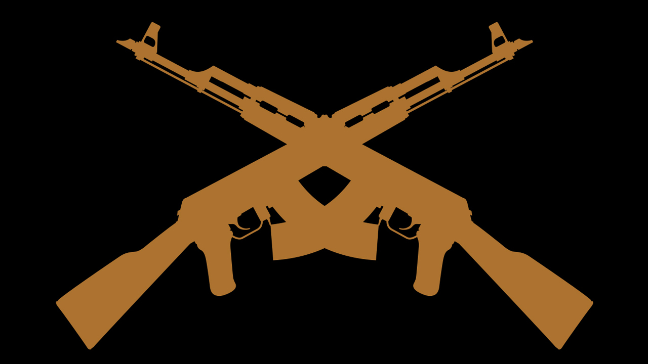
Branding Terror — a book by graphic designer Francesco Trivini and former counter-terrorism analyst Artur Beifuss — is a fascinating study on the aesthetics of terrorism. The book is meant to serve as an encyclopedia of the logos and symbols that terrorist organizations around the world use as their calling cards, and an analysis of these images from a […]
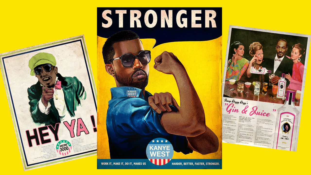
In “Ads Libitum,” French artist David Redon replaced Uncle Sam with André 3000 and Rosie the Riveter with Kanye West in classic American political posters. His vintage magazine ad remixes have these nice little hand-drawn details and meticulous digital flourishes, all for the sake of hip hop lyrics puns in an advertising context. Dirt Off Your Shoulders shampoo or So […]
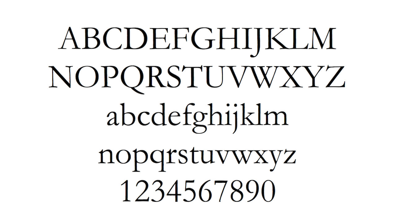
The story of Suvir Mirchandani, the 14-year-old who discovered the federal government could save hundreds of millions of dollars a year with a simple switch of fonts on printed documents, seems too good to be true, and as it turns out, it is. As part of a middle school science fair project, Mirchandi found that […]
Milton Glaser, he of “I <3 NY,” the New York magazine logo, that famous Bob Dylan illustration, and countless other iconic designs, is also responsible for all of Brooklyn Brewery’s brand identity. So it’s only fitting that the New York Times asked Glaser to critique the labels of several other independent breweries, most of which, of course, are pretty […]