
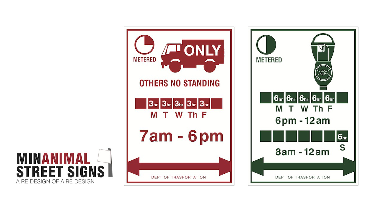
Last week, the City of New York announced that it would be rolling out newly designed parking signs to replace older, more confusing ones. A major part of that overhaul, which was done by a design firm with one of the coolest names ever, consisted of a “simplified layout that cuts back on the number of words and colors and adds some much-needed white space.”

(Left: Old Signs, Center: Newly Redesigned Signs, Right: ANIMAL’s Newly Redesigned Signs)
So, we enlisted ANIMAL design architect Michael Weinfeld to take that concept a step further and minimalise the signs even more. We’ve also reduced the amount of characters and replaced words with pictograms. Instead of laying out the word “commercial vehicle” for example, an image of a truck was used instead.
Additionally, below is a design for an alternate side parking sign as well as a display of our of how we’d use left and right arrows.

